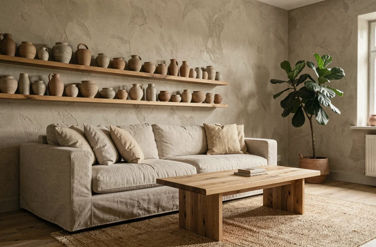
A well-placed sofa, a wall color that changes the atmosphere of a room, a light fixture that sculpts the space in the evening: interior decoration relies on concrete, sometimes technical choices that go beyond mere taste. Successfully decorating is about articulating practical constraints (natural light, circulation, air quality) with a coherent aesthetic intention.
Labeling emissions: the health criterion that decoration often ignores
Have you ever noticed a small colored label on a paint can or a wooden panel? Since September 1, 2013, construction and decoration products sold in France display a rating from A+ to C based on their emissions of volatile organic compounds (VOCs).
This rating applies to paints, adhesives, varnishes, floor coverings, and even some furniture. Choosing products rated A+ reduces indoor air pollution, a factor often overlooked when selecting a color or covering solely for its visual appeal.
The idea is not to give up on aesthetics. It involves checking the label before purchasing, just as one would check the ingredients of a food item. Combining these choices with regular ventilation (even ten minutes of cross-ventilation per day) transforms the air quality of a room without compromising style. Specialized shops like so-mauricette.fr offer decorative items that combine aesthetics and a responsible approach, a reflex increasingly common in French interiors.
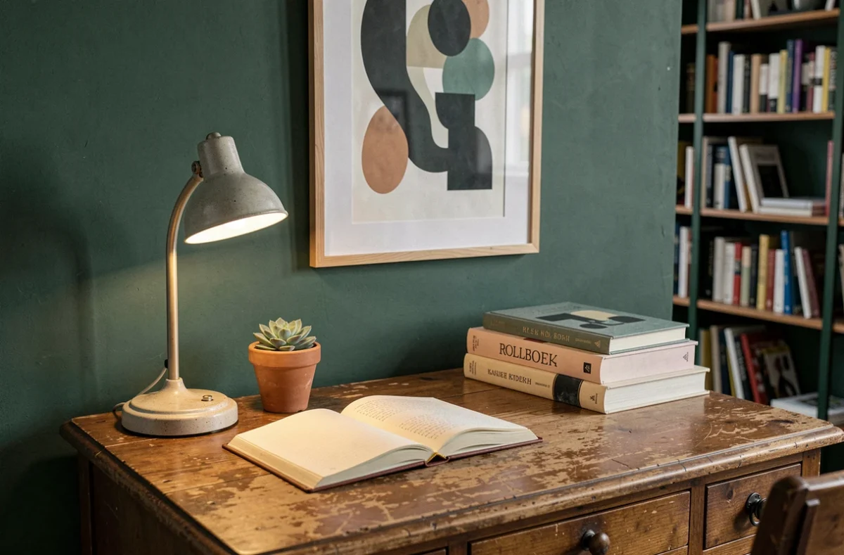
Color palette and interior decoration: starting from light, not a trend
The choice of colors is often the first decorative gesture. You flip through a magazine, spot a tobacco brown or a deep eggplant, and imagine the result at home. The problem is that the same shade can change radically depending on the room’s orientation.
Test before painting an entire wall
A warm color (terracotta, ochre, lime) works well in a north-facing room, where natural light remains cool. Conversely, a sun-drenched room in the afternoon can make an eggplant wall feel suffocating rather than enveloping.
Applying a sample on a square of at least 50 cm on each side and observing it at different times of the day avoids unpleasant surprises. Artificial evening light also alters perception: an off-white can turn yellow under a warm bulb.
Limit the number of shades per room
Three colors are sufficient in most cases: a dominant (walls, floor), a secondary (main furniture, curtains), and an accent color (cushions, vase, frame). This simple rule avoids visual overload and creates a readable harmony even in a small space.
Furniture and circulation in space: planning before purchase
Buying a piece of furniture because you like it, then looking for where to place it, is the source of most cluttered interiors. Drawing a scaled plan of the room before any furniture purchase changes the logic: you start from the available space, not from the catalog.
Circulation in a living room requires passages of at least 60 cm between furniture. Below that, you have to navigate around, bump into things, and end up not using certain items. A sofa that is too large in a medium-sized living room eliminates passage space and makes the room feel static.
- Measure the room (length, width, position of openings) and transfer the dimensions onto graph paper or a free 2D planning app.
- First, place the main piece of furniture (sofa, bed, table) while respecting the passage zones, then add secondary elements.
- Ensure that every door and window opens without hitting a piece of furniture, including drawers in the open position.
This preliminary work takes an hour. It avoids months of frustration and costly furniture returns.
Circular decoration and reuse: an aesthetic as well as ecological lever
The French extended producer responsibility scheme for construction materials sets progressive reuse targets: 2% in 2024, 4% in 2027, and 5% in 2028, according to the decree of June 10, 2022. This regulatory framework encourages professionals to recover old materials, but it also opens up concrete possibilities for individuals.
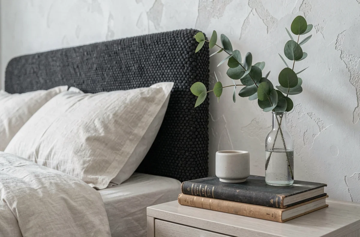
A reclaimed cement tile or an antique door brings a texture that no new product can replicate. Patinated wood, period ironwork, and glazed tiles from an old bathroom become characterful elements in a contemporary interior.
Mixing reused pieces with recent furniture works as long as a coherent palette is maintained. A 1950s oak sideboard, sanded and waxed, fits into a living room with neutral tones without appearing dated. The contrast between old materials and modern lines creates a visual tension that adds depth to the decoration.
Artificial light and ambiance: multiply sources rather than intensity
A single ceiling light illuminates a room in a flat manner. Three light sources at different heights are enough to create a true ambiance: general lighting (ceiling light or pendant), functional lighting (reading lamp, worktop spotlight), and accent lighting (table lamp, string lights, candle).
The color temperature matters as much as the intensity. For a living room or bedroom, warm light (around 2,700 kelvins) is relaxing. For an office or kitchen, a more neutral light facilitates concentration and precision.
- Placing a table lamp next to the sofa creates a pool of soft light that invites sitting down.
- A dimmer on the main pendant allows for a transition from bright lighting during the day to a dimmed ambiance in the evening.
- LEDs consume little and come in all color temperatures, making this setup accessible to all budgets.
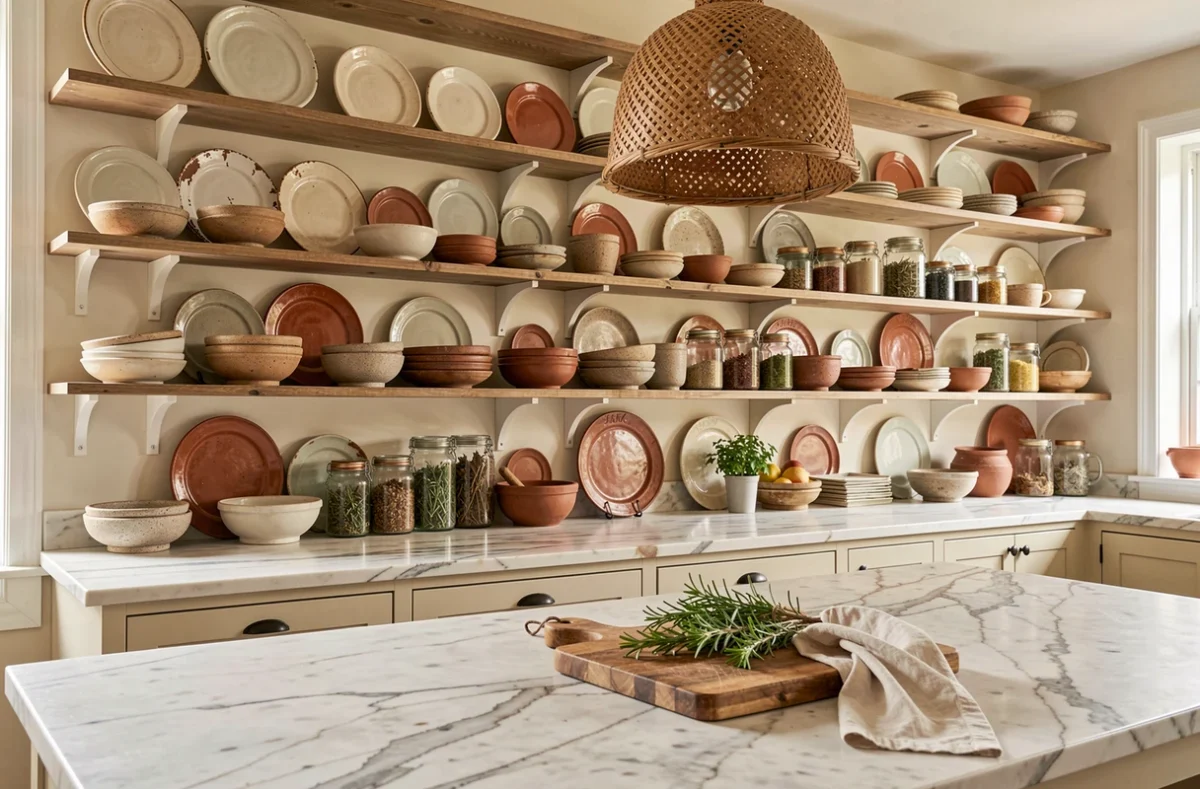
Successful interior decoration relies less on a specific style than on a method: checking the air quality of chosen materials, testing colors in the actual light of the room, planning circulation before purchasing, and layering multiple light sources. These often discreet technical gestures make the difference between an interior that is merely looked at and one that is truly lived in.